#petportraitswithcolour


First things first...
Are you bored of having the same background on all of your studio images? either white, black or grey... well this tutorial is for you!
I started creating these portraits with fun and colourful backgrounds for the same reason, because let's be honest, to have all the colour backdrops, is not practical, and it can be very costly. So I will help you achieve this in a more efficient way which requires very little time.
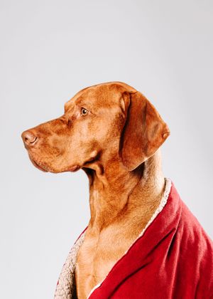
For this tutorial, I will be using my dad's lovely dog, Bentley. He is a beautiful Hungarian Vizsla. He makes such a great model for my photography.
So what you will need to have to achieve this is:
- A pet portrait (ideally shot on a white background as this will help with selection)
- Adobe Photoshop
- Basics in Photoshop
- Up to 10 minutes of your time
That's it, we're ready to get started!
Cutting Out
It is important when opening up any file in photoshop, that you create a duplicate layer (CTRL+J) as this will make your work flow non destructive.
On the duplicate layer, use Select > Subject to select your pet from the background. Normally this does a pretty accurate job, but sometimes is doesn't. This is dependent on your lighting or the colour of the pet.
The more contrast, the better the selection.
TIP: Use the pen tool to refine your selection, by drawing around the areas missed, using the top toolbar - Make: Selection > Add or Subtract Selection

Layer Mask
Ok, so we have your pet cut out now, with a transparent background but we need the make sure it doesn't look like it's just been cut out on to a background. We want it to look realistic, so we need to adjust the settings of our Layer Mask.
To do this we simply click double click on the Layer Mask (the black and white image on your Layers tab) and a new window will open up with settings that will appear on the right hand side. Your settings will be different to mine as it will vary based on your image.
I usually adjust the Radius to 1px and Feather between 1-2.0px. Shift Edge - use the slider to experiment, but I have brought it back to -62% to ensure there is no whitening around my selection.
TIP: Change the colour at the top and the opacity to 100% to see clearly what the settings are doing to your photo more clearly. You can use any colour, I like to switch between a few.


Solid Colour
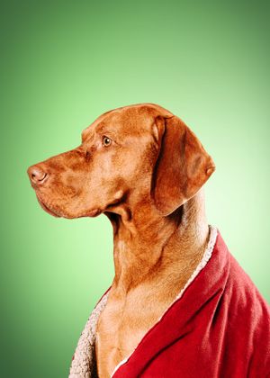
Now, we need to choose a base colour for your background. On your layers tab at the bottom there is an Adjustments Icon (circled red), click that and on the drop down menu you will see Solid Colour, select that and it will create another layer called Colour Fill 1. You will see that it opens up a Colour Picker window, there you can select your base colour you want for your background.
Think about the colours you use, like does it compliment the other colours in your image? This can take some time, I am very indecisive about things like this, but that's okay. I knew I wanted something to embrace the majestic look, so I used Green to complement the Red blanket. If I used Blue, it would have created a completely different feel to the image.
Radial Gradient
Great, so we have your pet on a background but it feels like it's missing something... it needs depth and lighting. On the right hand side, you can see I have selected multiple Solid Colour layers within a Group called Backdrop. I have highlighted these to show you the amount of colours I have used to build up the background.
On some of Layer Masks, I have used Radial Gradient to brush in each colour. To use this tool, you select the Gradient tool on the right tool bar, and then select Radial Gradient at the top (second one in).
I have used a White Solid Colour right behind Bentley's head, as there is quite harsh and bright lighting on his fur.
TIP: Use the similar colours to your base colour, by using shades of that colour, rather than a completely different colour. This will help blend your background and make it look more realistic.

Final Adjustments
Lastly, you can add final adjustments, such as Camera Raw, Hue/Saturation, Levels, etc. This will help make your portrait look apart of the backdrop. So now you have a realistic looking background, how simple but effective was that? It's a great tool to have, especially if you want a clean looking backdrop without the hassle and cost. What's better is that you can save these backgrounds which will save you even more time in the future.
I hope this was useful and helped you achieve similar results. Keep your eyes out for more retouching content. I really enjoy doing these. Also if you have any questions please do not hesitate to contact me here.
Are you more of a visual learner? Here's a video!
I would love to see your results! Please tag me in your Instagram posts and #petportraitswithcolour so I can see how you have done!
